
This series of posts is aimed both at people who want to learn more about SAS and to show how people can use the free SAS University Edition to explore the data from the Kaggle Titanic: Machine Learning from Disaster competition.
In our previous tutorial Getting Started with SAS University Edition we looked at how to import a spreadsheet into SAS and how to use PROC FREQ to explore the relationship between the categorical variable sex and the chance of survival. In this tutorial we look in a bit more detail at the PROC FREQ procedure. This tutorial covers the following:
- How to use PROC FREQ to create one way tables, two way tables and more.
- What the data in each section of the PROC FREQ output means.
- How to use the PROC FREQ output to explore your data and draw conclusion about it.
- How to group data together so that its PROC FREQ output is more user friendly.
- How to produce a dataset from the PROC FREQ.
- How to produce a graph using PROC FREQ.
We assume that you already have SAS University Edition installed and have used PROC IMPORT to read the train.csv file and convert it to a SAS dataset (work.train). If you haven’t done that yet, please refer to the first tutorial.
PROC FREQ
Officially PROC FREQ is designed to ‘produce one-way to n-way frequency and contingency (crosstabulation) tables’ what this means in practice is that it is used to answer questions such as how many…? or what proportion of…? of a particular categorical variable falls into each category. For example, what proportion of passengers survived the titanic disaster. The ‘n-way’ section of the definition means that as well as looking at the proportion of a single variable that fall into each category, we can also look at the proportion of 2,3,…n variables which fall into particular categories, for example, a two way table might show what proportion of passengers in each class survived, whereas a threeway table might show the proportion of passengers of each gender who survived.
One way frequency tables
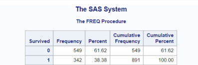
To produce a one way frequency table we use the TABLES statement along with a single variable. For example if we want to see the number and percentage of passengers who survived we would submit code like the following:
PROC FREQ DATA = train;
  TABLES survived;
RUN;
This would produce output similar to the below, from which we can quickly see that 38.4% of passengers in the training dataset survived and 61.6% died:
Two way frequency tables
To produce a two way frequency count, we would add a second variable to the TABLES statement.
PROC FREQ DATA = train;
  TABLES sex*survived;
RUN;
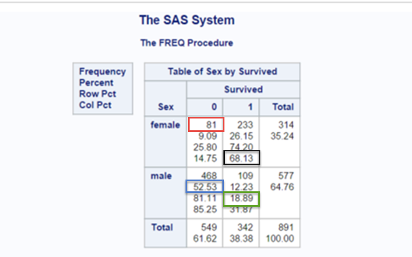
When producing a two way tables, notice how the variable that you specify first forms the rows of the resulting output and the variable that you specify last forms the columns. Leaving the total information aside for a moment, you will notice that the table contains four cells. Each cell contains data for a particular level of the row (sex) and column(survived) variable.
In our example our four levels are Female and did’t survive (upper left), female and did survive (upper right), male and didn’t survive, (lower left), male and survived (lower right).
You will notice that within each cell there are several numbers, PROC FREQ by default PROC FREQ will supply the following information:
- the first number in each cell is the frequency, i.e. a count of the number of events (passengers) at the particular level of row (sex) and column (survived) variable (in our example this is the number of passengers who fall into each category, for example, 81 female didn’t survive (see the red square)).
- the second number is the percentage, i.e. the number of events at the particular level of row and column variable as a proportion of the total number of events expressed as a percentage (in our example this is the frequency of passengers at each level divided by the total number of passengers present in the table, for example 52.53% of the total number of passengers are males who did not survive (see the blue square)).
- the third number is the row percentage, i.e. the number of events present in a particular cell as a proportion of the total number of events in that row expressed as a percentage(in our example this is either the proportion of male passengers who survived or didn’t survive, divided by the total number of male passengers, or alternatively the proportion of female passengers who survived or didn’t survive, for example, 18.89% of males survived (see the green square)).
- the fourth number is the column percentage, i.e. the number of events present in a particular cell as a proportion of the total number of events in that column expressed as a percentage (in our example this is either the proportion of survivors of a particular gender divided by the total number of survivors or the proportion of fatalities of either gender divided by the total number of fatalities, for example, of those that survived, 68.13% were female (see the black square)).
Finally the total row shows the row frequencies, i.e. the total number of males and females and the row percentages, i.e. the total number of males or females as a percentage of the total number of passengers. The total column shows the column frequencies, i.e. the total number of survivors or fatalities and the column percentages, and also the column percentages i.e. the total number of survivors or fatalities as a percentage of the total number of passengers.
n-way frequency tables
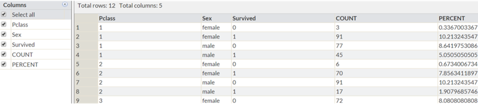
Now if we wish to explore the relationship between more than two variables we can also do that with PROC FREQ, for example if we wanted to explore the relationship between PCLASS, SEX and SURVIVED we add in the additional variable to the tables statement as follows:
PROC FREQ DATA = train;
  TABLES pclass*sex*survived /NOCOL NOPERCENT ;
RUN;
This will produce one two way frequency table (sex by survived) for each level of the PCLASS variable (1,2,3), giving a total of three tables as shown below. Note also that we used the NOCOL option to surpress the printing of the column percentages and NOPERCENT to surpress the printing of the overall percentages. We are not interested in these figures at the moment, so removing them helps to draw attention to the items of interest.
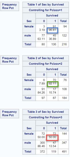
This table gives us useful information which is not available in the two way table, for example it tells us that:
- among 1st class female passengers, 96.81% survived (blue square in first table).
- among 2nd class female passengers, 92.11% survived (green square in second table).
- among 3rd class female passengers, 50% survived (red square in third table).
Similarly we see that 2nd and 3rd class male passengers had a very low chance of survival, whereas around one in three first class male passengers survived.
Output datasets
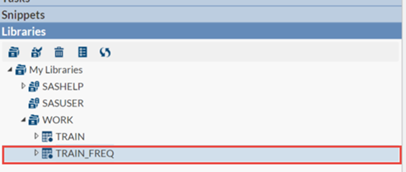
Sometimes it can be useful to use the results of printed output in subsequent calculations. PROC FREQ has an option which enables you to create an output dataset containing the results of its calculations. To do this use the OUT= option and the dataset name, as shown below:
PROC FREQ DATA = train;
  TABLES pclass*sex*survived /out = train_freq ;
RUN;
This will create the dataset train_freq shown below in your work library (highlighted in the red box)
PROC FREQ with continuos data
PROC FREQ is works best with categorical data that takes a relatively small number of values, the age variable takes 88 different values (excluding the passengers with unknown age), lets see what happens when we use the PROC FREQ procedure on the age variable:
PROC FREQ DATA = train_bin;
  TABLES age *survived   ;
RUN;
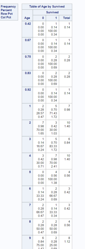
The output it produces is so large that we can only fit a small section of it on the page at any one time. Does it contain any useful information? Perhaps but the number of passengers in each age group is so small that it’s difficult to draw any conclusions from it. A better approach is to first group the data into a smaller number of categories and then to use this grouped data to in your PROC FREQ. This process of grouping data is formally called binning. There are several ways to achieve this, one simple way is to use the IF…THEN…ELSE logic we learnt in the first tutorial.
This can be achieved using code similar to the below, here we create a new variable AGE_GRP which groups the ages of passengers into 10 year bins.
DATA train_bin;
  LENGTH age_grp $20;
  SET train;
  IF .< age <= 10    THEN age_grp = "0-le10";
  ELSE IF 10<age<=20 THEN age_grp = "gt10-le20";
  ELSE IF 20<age<=30 THEN age_grp = "gt20-le30";
  ELSE IF 30<age<=40 THEN age_grp = "gt30-le40";
  ELSE IF 40<age<=50 THEN age_grp = "gt40-le50";
  ELSE IF 50<age     THEN age_grp = "gt50-le20";
RUN;

PROC FREQ DATA = train_bin;
  TABLES age_grp *survived /nocol nopercent ;
RUN;
The output of this procedure will be as shown below:
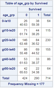
This table is definitely more informative than the table in which we treated each age as a separate category. We know from the one way frequency table we produced at the beginning of the tutorial that 38% of passengers in the training dataset survived. We can see from this table that 59% of the passengers in the training dataset who were under 10 survived. Suggesting that children were much more likely to survive the disaster. The previous tutorial showed that women were far more likely to survive than men, our data therefore suggests that the idea that ‘women and children’ had priority in the lifeboats is probably based on fact.
If you open the train_bin dataset you will notice that the age variable is often missing. SAS represents a missing numeric variable with the period symbol. When we assigned our observations to bins, we did not assign the observations with missing values to any bin, the AGE_GRP variable is therefore missing for these observations. PROC FREQ excludes this data from its output, the number of excluded observations is shown by the “Frequency Missing = 177″ line underneath the table.
Graphs with PROC FREQ
Finally PROC FREQ also offers the ability to create basic charts. Viewing your frequency counts in an alternative format can be very informative and with PROC FREQ this can be achieved with very little effort. Adding the option PLOTS = FREQPLOT will produce the barchart shown below.
PROC FREQ DATA = train;
  TABLES embarked*survived /NOCOL NOPERCENT PLOTS = FREQPLOT  ;
RUN;
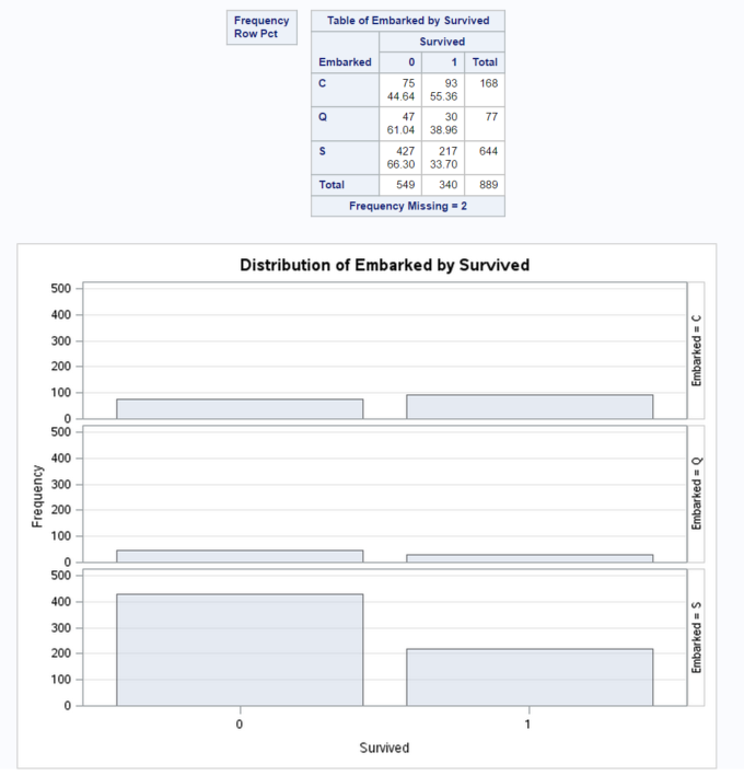
From this bar chart we can quickly see that:
- the proportion of passengers who embarked at Cherbourne and survived seems to be much greater than the proportion who embarked at other ports.
In the next tutorial we will look at how we can create and customise more complex graphs.
Summary
In this tutorial we have shown how PROC FREQ is a powerful tool for couting data and how ii can be used to create a printed table, a SAS dataset and a graph. We’ve also seen how this output can be used to identify patterns in your data and in particular to see whether certain subgroups have different characteristics.
Using the example code above as a basis try to examine the impact that different combinations of variables have on the probability of survival, by for example adding and removing variables to the tables statement and investigating the output. In the next tutorial we will look at how to create and customise more complex graphs and how to use these graphs to investigate your data.
Hey, its was a very great tutorial I would really appreciate if there were more on SAS – titanic dataset, can we expect more anytime soon?